Text over images
When using typography over an image or brand pattern, make sure there is enough visible contrast from the background to protect legibility.
Text and photography
When using text overlaid on photography, you can apply a dark overlay to the photo to let the text pop off the background. This can either be full coverage or a select portion of the image using a gradient effect.


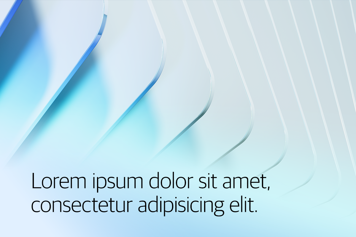
Use a gradient to increase the contrast of the text.


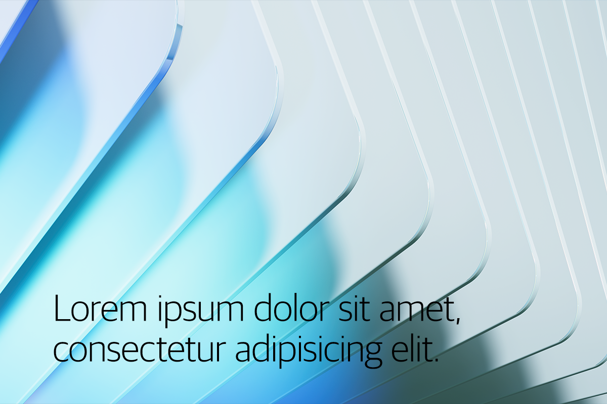
Don't just place the text on an image.
Text and brand patterns
When using text overlaid on a brand pattern, make sure to follow the brand pattern guidelines to avoid using pattern colors that have too much contrast. In the areas where the text and pattern overlap, you can feather the pattern, so it does not appear at full opacity under the text.
Feather out the pattern where the text overlaps it or add a gradient behind the text.
Don't just place the text over a pattern. This results in low contrast and reduces readability.
Text color and accessibility
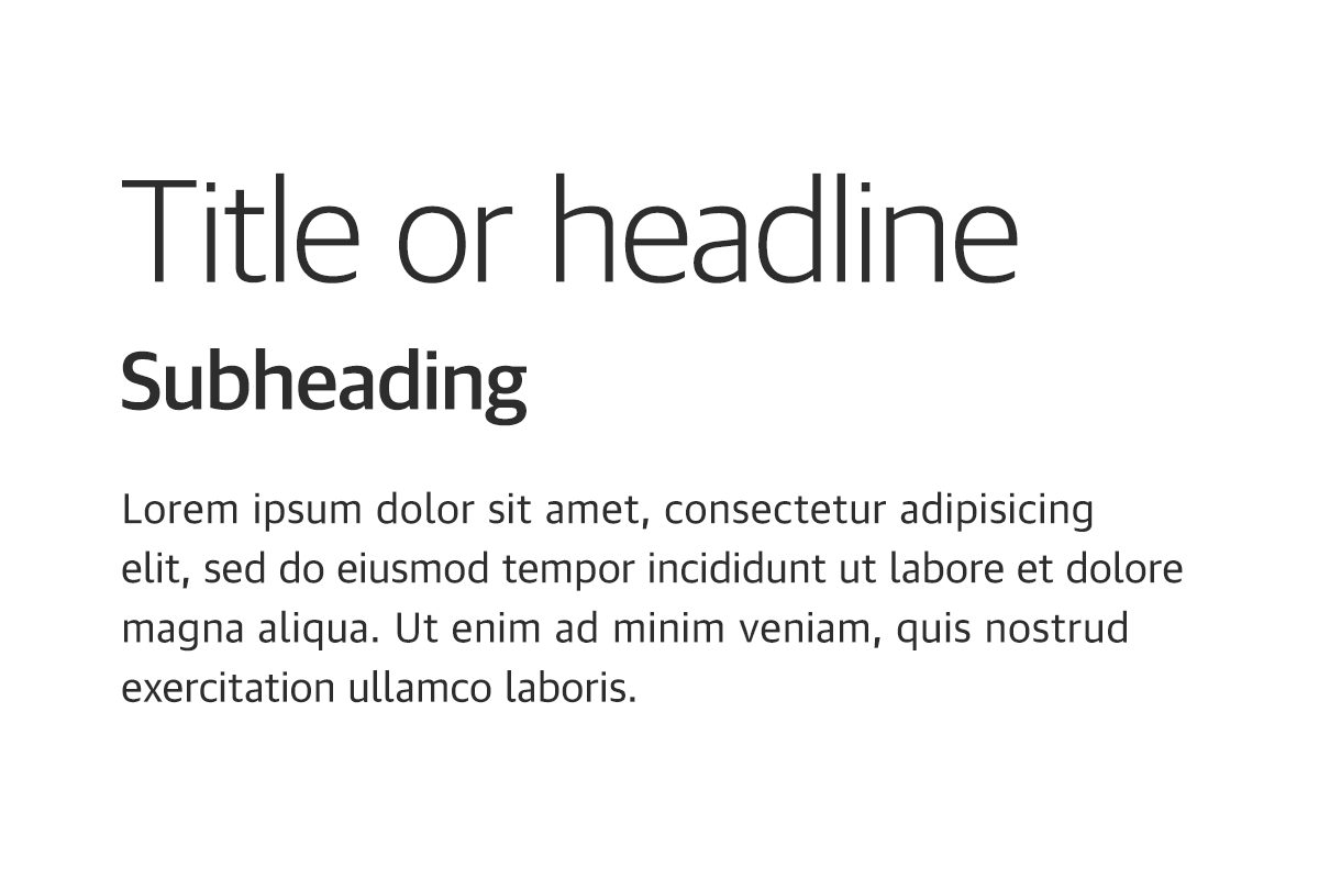
Generally speaking, neutral900 should be used for all text on light backgrounds.
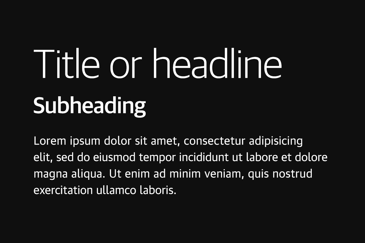
Generally speaking, white should be used for all text on dark backgrounds.
All text should be legible and meet accessibility standards. The Web Content Accessibility Guidelines (WCAG 2.0) level AA requires a 4.5:1 color contrast between text and background for normal text, and 3:1 to large text.
In circumstances where additional colors besides gray and white are desired, feel free to use any colors within our brand color palette provided there is sufficient color contrast between the font color and background color. Use the Adobe Contrast Checker to determine if your color pairing passes or fails a contrast check.
To learn more about color, contrast, and accessibility design, read Accessibility - IBM Carbon Design.
Guidance
Below are some best practices to keep in mind when creating the various assets for your event.
Do
Use pre-set type styles whenever available
Use the correct typeface for headlines and body copy
Maintain a clear messaging hierarchy
Maintain ample white space throughout your design
Maintain 50–60 characters per line in body copy
Don't
Overuse bolder weights
Use all-caps for headlines
Use headlines that exceed three lines
Use inaccessible/low contrast color combinations
Overcrowd layouts with large typography or excessive body copy
Exceed 60 characters per line in body copy