Introduction
Typography, or the design and use of text, is a major part of our brand expression. Since most content is mainly text, it’s important that we have a unique typeface that supports our overall brand essence. Typography, when used well, can create a visually appealing layout alone. Text sizes, weights, and color can all be used to create texture, contrast, hierarchy, or draw emphasis to certain elements.
Primary typeface: Guardian Sans
Our primary typeface is, Guardian Sans. It reflects the ruggedness and versatility that our products offer. The typeface exhibits a rational and clear disposition, lending a serious air to the text, while the display components capture a wide range of moods with their comprehensive range of weights.
Guardian Sans is divided up into two different families: Guardian Sans Headline and Guardian Sans Text.

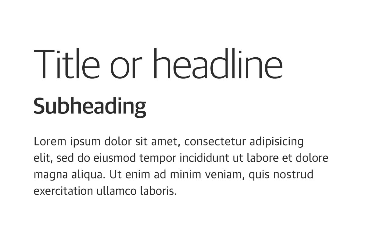
Guardian Sans Headline
This family of Guardian should be used for all headlines and large text. While simple, this typeface still has quite a bit of personality that shines best at a larger scale.

Guardian Sans Text
This family of Guardian should be used for all body copy and captions. It is intended for reading long blocks of text and for use in infographics, charts, and diagrams.
Language support
Guardian Sans is available in Latin, Cyrillic and Greek character sets, in Open Type and True Type formats so this font can be used in all languages on all platforms.
For Chinese, Japanese, and Korean (CJK) languages, we use the Source Han Sans typeface family, available through Adobe Fonts with dedicated language subsets for each region.
Font files
If you are a creator with a need for the Guardian Sans font, please reach out to brand@topcon.com
Weights and styles
Using different weights in typography, like bold or regular text, is important because it helps highlight important information and makes it easier for people to read and understand a document or webpage. For example, using bold for headings or important points to guide your attention and make things clearer.
Titles and headlines should use Guardian Sans Headline in either headline or sentence case.
Approved headline weights:
- Light / Light Italic
- Regular / Regular Italic
- Medium / Medium Italic
- Semibold / Semibold Italic

When working with various levels of information, make sure that you maintain a clear hierarchy. For best readability, text boxes should should allow for no more than 60 characters per line for body copy.
Approved body text weights:
- Bold / Bold Italic
- Regular / Regular Italic