Introduction
Icons are a visual expression of our technology, products, or concepts. They communicate the core idea of something in a simple and compact format. While every icon should be unique, they must all work together and be created using a unified and consistent method.
Our icon library is based on IBM Carbon design standards. Below are some guidelines that are most important to take into consideration when creating icons. For further guidance, please reference the IBM Carbon icon usage guidelines.
The Topcon icon library is split into three groups: brand icons, software icons, and user interface icons. Our brand icons can be used to communicate things such as an industry, product category, product feature, benefit, and more. They are created to be a simple and compact visual representation of a thing or idea. They are not meant to be overly illustrative or detailed. When more detail is needed, a photograph or 3D render should be used in place of an icon.
Icon downloads
Access the official Topcon icon library below, selecting from print or digital versions to ensure optimal display for your specific deliverable. For designers and content creators, please reach out to brand@topcon.com for access to the Adobe Creative Cloud and Figma libraries.
Usage and color
Brand icons can be used for a variety of applications such as on a webpage, in a brochure, on a social media graphic, in a presentation, and much more. The icons are created as vector graphics allowing them to scale up and down without pixelation. Their color can be changed easily using design programs like Microsoft PowerPoint, Adobe creative tools, and a handful of other design programs.
Icons in shapes

Icons can be used as a standalone graphic element, within a circle, or rounded square.

Don’t use an icon within a hexagon, triangle, or any other shape. The only exception being that legacy software branding may still be used within a hexagon until updated branding is provided.
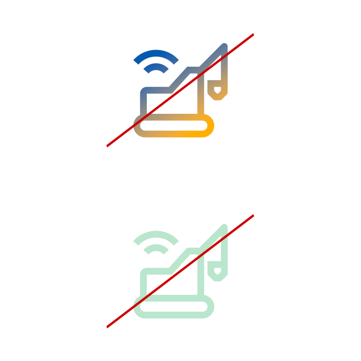
Icon color
For general usage, brand icons should always appear in black, either on a white or a blue400 background. This ensures clarity and consistency across all applications.
Don’t use gradients, non-approved colors, or a mix of low contrast colors with icons.
Icon sizing
Use icons only as a minimal graphic support element.
Don’t use the icons at a large scale in a way you would use an illustration or a photo. Icons are only intended to be used at a small scale.
IBM Carbon Icon Library
If an icon you’re looking for is not included in our library, you can also use any icon available from the IBM Carbon icon library. Since our icons are based on IBM Carbon’s design standard, any icon created by them would work within our brand system.
Design and production guidelines
Don’t see the icon you need in the library? Make your own! Follow these guidelines to ensure visual consistency and proper formatting.
- All icons should be unique and not redundant with any existing icons in the system. Search the library for the keyword(s) associated with your proposed new icon to ensure that it is not already represented.
- All icons should adhere to the IBM Design Language visual style.
- All icons should comply with IBM accessibility standards.
- All icons should be usable across all supported platforms and devices.
- All icons should be understandable by a global audience of users, regardless of nationality or language.
Making an icon
- Create a 32px x 32px artboard for each icon.
- 32px icons should have 2px padding.
- Set your workspace up from the start to snap to pixels and round values to whole pixels to avoid correcting shapes later.
- Never use center borders. Centering can cause half pixels.
- Avoid using the line tool; use the rectangle tool instead. The line tool will place the vector on half pixels.
- Be aware of automatic alignments which can place vectors on uneven or half pixels.
- Ungroup icon layers completely. The icon should be on the top-most layer in your artboard.
- Make sure to properly name layers and artboards. These names will also be exported into the code.
Production-ready
To be considered production-ready, all icon submissions must be delivered in SVG format at 32px x 32px for integration with Topcon branded materials and templates.
- Icons should be at whole pixels. No decimals are allowed in x and y coordinates or width and height fields
- Each artboard and the artwork within it must be aligned to the pixel grid
- All strokes must be expanded and at full pixel values
- All possible shapes and paths should be combined
Exporting SVGs
Export SVGs from Adobe Illustrator
- Draw a 32px x 32px artboard. 32px icons should have 2px padding.
- Place the icon squarely on the artboard, making sure it’s aligned to the pixel grid.
- Expand all strokes
Object > Expand. - Select all overlapping shapes and click the
Uniteicon in thePathfinderpanel to merge all of the shapes together. - Make sure the icon is at
#000000and has no additional styling. - Select
File > Save a Copy…from the top navigation. - On the
Formatdropdown selectSVG. - Below
FormatselectUse Artboard, then select either all or a range of artboards, depending on your need. - Click
Save. - The
SVG Optionsdialog will then open. - Make sure the preferences are the same as in the image shown here.
