Introduction
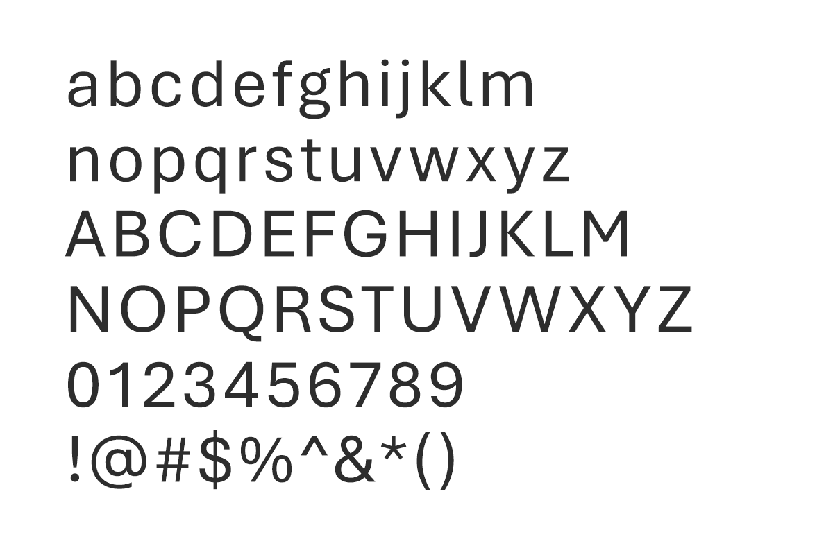
All company correspondence like emails, letters, faxes, PowerPoint presentations and other documents are executed using the various Aptos types. Aptos is present on most computers and allows editable documents to be read and modified without any problems. Exceptions may be made if the correspondence recipient requests a different font.
System typeface: Aptos

Aptos
Microsoft's default system font as of 2023. Topcon is adopting this as our default system typeface.
Language support
Aptos is available in Latin, Cyrillic, and Greek character sets, supporting a wide range of languages that use these scripts. It comes in both OpenType and TrueType formats, ensuring broad compatibility across most platforms and applications.
Weights and styles
Using different weights in typography, like bold or regular text, is important because it helps highlight important information and makes it easier for people to read and understand a document or webpage. For example, using bold for headings or important points to guide your attention and make things clearer.

Titles and subheads both use the "regular" weight of Aptos. They are differentiated from one another by scale and color.

When working with various levels of information, make sure that you maintain a clear hierarchy. For best readability, text boxes should should allow for no more than 60 characters per line for body copy.

