Introduction
When used at a small size or when used within software for navigation or functional uses, our user-interface icons should be used. The level of detail in our brand icons would be too much for these use cases and could result in the loss of legibility. Rather, the user-interface icons are created using a simplified pixel grid to ensure icon legibility at the smallest sizes.
Icon shapes are bold and geometric. They have a symmetrical and consistent look, ensuring readability and clarity, even at small sizes.

Shape overview
When creating an icon, view and edit it at 400% (192 x 192 dp), which will display edges at 4dp. By maintaining this ratio, any changes to the original will be scaled up or down proportionally, which preserves sharp edges and correct alignment when the scale is returned to 100% (48dp).


Make icons graphic and bold.


Don’t use delicate, thin stroke weights.

Use geometric, consistent shapes.

Don’t use gestural or loose organic shapes.
Icon sizes
When creating an icon, view and edit it at 400% (192 x 192 dp), which will display edges at 4dp. By maintaining this ratio, any changes to the original will be scaled up or down proportionally, which preserves sharp edges and correct alignment when the scale is returned to 100% (48dp).

1:1 Unit grid

4:1 Unit grid
The icon grid establishes clear rules for the consistent, but flexible, positioning of graphic elements.
.webp)
Grid
.webp)
Keyline
Layout
Icon content should remain inside of the live area, which is the region of an image that is unlikely to be hidden from view (such as when sidebars appear upon scrolling).

Live area
We connect with our clients in meaningful ways that show we understand their challenges and goals.
Padding
2dp of padding surrounds the live area.

Dense live area
Icon content is limited to the 16dp x 16dp live area, with 2dp of padding around the perimeter.

Dense padding
2dp of padding surrounds the live area.
Keyline shapes
Keyline shapes are based on the grid. By using these core shapes as a baseline, you can maintain consistent visual proportions throughout your product icons.
.webp)
Square
18dp x 18dp
.webp)
Circle
20dp diameter

Vertical rectangle
20dp x 16dp (H x W)

Horizontal rectangle
16dp x 20dp (H x W)
Clarity (Pixel perfection)
To avoid distorting an icon, position icons “on pixel” by making the X and Y coordinates into integers, without decimals. To avoid distorting an icon, position icons “on pixel” by making the X and Y coordinates into integers, without decimals.
.webp)
Position icons “on pixel.”
.webp)
Don’t place the icon on a coordinate that isn’t “on pixel”.
Corners
Corner radiuses are 2dp by default. Interior corners should be square, not rounded. For shapes 2dp wide or less, stroke corners shouldn’t be rounded.

Exterior corners with 2dp corner radii

Interior corners
Stroke
System icons use a consistent stroke width of 2dp, including curves, angles, and both interior and exterior strokes.

2dp stroke

Stroke terminal

Use consistent stroke weights and squared stroke terminals.

Don’t use inconsistent stroke weights or rounded stroke terminals.
Google Materials Icon Library
The full library of our brand icons can be accessed via the Topcon Marketing HUB.Additionally, for creators who have access to the Adobe Creative Cloud Suite, our icons can be accessed via the Topcon Icon Creative Cloud Library. For access to this, please email brand@topcon.com.
If an icon you’re looking for is not included in our library, you can also use any icon available from Google font library for icons. Since our icons are based on Google’s design standard, any icon created by them would work within our brand system. Just follow the guides below to make sure your settings are set correctly to download the correct format of icon.
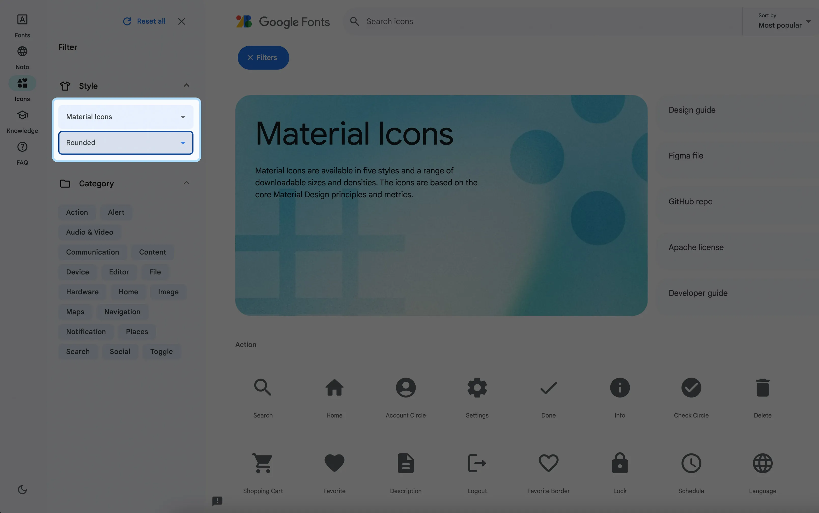
Please make sure you follow the settings shown above when downloading an icon from Google’s library:
- "Material Icons" is selected
- "Rounded" style is selected
All icons downloaded should be in “.svg” format. This will allow you to change the icon color in tools like PowerPoint. Make sure to only use the brand approved color palette.
For icons you commonly use from Google, please notify the brand team for consideration to adding to our brand library.