Introduction
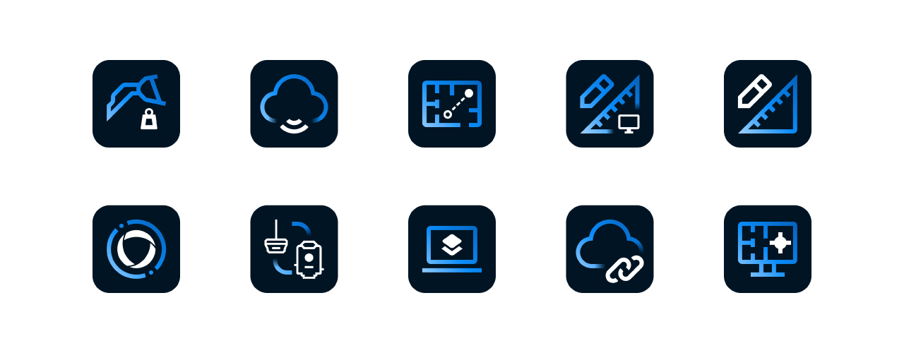
Our software icons are our most expressive set of icons, designed to stand out and clearly represent individual applications while still feeling like part of a cohesive software portfolio. While they allow for more visual expression than our brand icons, they should remain simple in nature, avoiding unnecessary detail so they are easily recognizable, scalable, and consistent across all platforms and use cases.
Same structure, different style
Our app icons are largely based on the styling of our brand icons, following all the same production guidelines other than color.
Brand icon example
Simple, single-color, outlined
Software icon example
*Not an actual Topcon product icon. The example above is for visual purposes only.
Elements
All software app icons consist of two to three elements: a color gradient stoke, a solid stroke, and an optional gradient stroke (depending on the icon shape). Each of these elements must appear at least once in the icon, and separate elements don’t touch each other.

Color gradient stroke

Solid stroke higlight
Color gradient
The color gradient provides color to the gradient stroke of the icon. This layer remains stationary on the icon grid at 45° and is masked by the gradient stroke for consistent color across each icon.
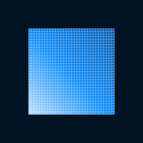
The color gradient layer remains stationary on the icon grid and is masked by the gradient stroke.

The color gradient is always at 45°.
Icon container
The rounded square is an integral component of the software icon and should always be present; the icon should never be displayed without it.

Software icons should always appear within a rounded square that is blue700.

Icons should not appear in squares*.
*Note - only time this is acceptable is when submitting icons to app stores where the icon border radius is defined by the operating system.
Only use the correct border radius
Do not place the icon on the same background color that the rounded square is.
Incorrect design and usage
The items below demonstrate non-compliant uses of our software icons and do not align with our icon design standards.

Gradient strokes and solid strokes shouldn’t touch.

Gradient strokes and solid strokes shouldn’t touch.

Gradient strokes and solid strokes shouldn’t touch.

App icons must include both solid and gradient strokes. Stroke higlight must not be feathered.

Don't distort the icon in any way

Don't highlight insignificant elements

Don't apply a drop shadow to the icon