Event Design

Introduction

As part of our evolving brand system, our new approach to event design introduces a unified framework that brings clarity, consistency, and purpose to every touchpoint. This includes everything from small 10x10 trade show booths to large-scale corporate events, HR recruitment fairs, and brand awareness activations. The goal is to ensure we show up with intention and cohesion, regardless of size or audience.

Rooted in a thoughtful design strategy, this approach emphasizes a clear hierarchy of information, emotionally resonant visuals, and a consistent brand voice. By balancing visual impact with storytelling, we create spaces that not only attract attention but also communicate who we are and what we stand for.

Content Hierarchy

Brand Foundation

This is the anchor of every event space. Our logo, tagline, and core brand elements establish who we are and set the tone across all formats. This layer is always present and should never be modified or deprioritized.

Industry & Human Context

Combining Operational Landscapes and Human-in-Action photography, this level adds context and emotional connection. Together, these visual styles provide both the “where” and the “who” of our story—showing Topcon technology in the field and the people who rely on it every day.

Product Visualization

This level provides clarity on what our actual products look like. Rather than using large product images on walls, we display products physically or through supplemental tools like digital screens and brochures—allowing visitors to engage with the technology in a self-guided, approachable way.

Booth-Sized Content Application

Booth size impacts layout, messaging density, and visual layering. Our framework classifies spaces into three tiers to guide content scaling:

Example with only one roll-up banner and table.

Example with a table and both a brand and industry/application roll-up banner.

Example with a single, brand-level back wall and table

Example with a single, brand-level back wall, industry/application roll-up banner, and table

Tier 1: Small Format Events (10x10 booths, tabletops, recruitment fairs)

  • Tier 1 events are compact in scale but carry significant brand-building potential. In these environments, space is limited and attention spans are short—making it essential to lead with bold, brand-level messaging and visuals that create immediate recognition and relevance.
  • At this scale, the focus should always be on brand awareness over product promotion. The Topcon logo, tagline, and corporate brand patterns should take center stage, establishing who we are before diving into what we offer. Only after this foundation is visually and verbally set should product messaging be introduced—if at all.
  • A variety of configurations can be used at small-format events: a simple backwall, one or more roll-up banners, a table with printed materials, or a looping monitor. Regardless of the mix, the layout must maintain a clear hierarchy: brand first, context second, and product last. Use Human-in-Action and Operational Landscape photography to tell a quick, relatable story. Product visuals, if included, should appear in brochures, tabletop displays, or screen loops—not dominate the booth’s primary graphics.
  • This tier is about making a memorable first impression. The goal is to spark interest, build recognition, and invite further exploration—not to deliver a technical deep dive.

Example with two back walls (one brand + one industry/application level), video monitor and a table

Tier 2: Medium Format Events (10x20 booths, regional shows)

  • Tier 2 booths provide more space to expand the story beyond brand awareness into industry and application relevance. These layouts must always begin with a brand-focused wall featuring the Topcon logo, tagline, and corporate brand patterns. The second wall is used to showcase industry or application-level content, using our approved template (see "Templates" section below) with Human-in-Action and Operational Landscape imagery.
  • The table must be centered between the two panels, with no gap between them to maintain a seamless visual flow. If roll-up banners are used, they should not block or overlap the backwall graphics.
  • Product-specific messaging should be limited to neatly arranged printed materials on the table or shown on a video monitor mounted to the right of the logo on the brand wall. This ensures brand and context come first, with product content presented in a clean, unobtrusive way.

Example of a Tier 3 show. Seen here, Topcon's bauma 2025 booth.

Tier 3: Large Format Events (20x20+ booths, global exhibitions, custom experiences)

  • Tier 3 booths are high-visibility environments designed for maximum impact and storytelling depth. With greater space comes the opportunity to create immersive experiences that communicate brand leadership, industry expertise, and technological innovation.
  • These booths should be structured around multiple visual zones—starting with brand identity, then expanding into industry context and product interaction. Use large-scale Human-in-Action imagery, Operational Landscapes, iconography, and interactive elements to guide visitors through the space in a logical, emotionally engaging way. Product visualization can include live demos, video walls, touchscreen stations, and printed collateral—but should always support, not overshadow, the brand story.
  • Due to the scale and complexity of these events, you must engage with the Corporate Creative Center of Excellence and Corporate Global Brand teams to ensure alignment. While considerations and layout guidelines are provided in this framework, each Tier 3 event is unique and will require a tailored solution based on the visual system and brand strategy outlined on this page.

Approach to photography

Operational Landscapes

Wide, aspirational imagery captured by drone, giving spatial and environmental context to our industries. These establish place and scale—often used as background or atmospheric framing.

Human-in-Action

Images showing real users interacting with Topcon technology. These are key to our human-centric branding approach, creating relatability and emotional connection while showing real-world usage.

Product-Centric

Photography focused on showcasing the design, scale, and use-case of specific Topcon hardware. Used selectively and in appropriate places like brochures, table displays, or digital monitors—not as dominant visual elements in booth graphics.

Templates (Tier 1 and 2)

These templates are built for ease of use and consistent application across all event types. They ensure a unified look and feel—no matter the size or format—and must be followed for all booths, roll-ups, and event graphics. Designed to scale, they simplify execution while maintaining brand integrity at every touchpoint.

Template on the left, example on the right

  • Short, eye-catching headline
  • Large Human-in-Action photo as main focus
  • Smaller Operational Landscape photo for background context
  • Brand pattern as subtle line art overlay, unifying both images
  • Iconography to reinforce category or industry
  • No logo needed since it should always appear alongside a brand wall
  • Template on the left, example on the right

    • Short, action-oriented headline
    • Human-in-Action photo as main visual
    • Operational Landscape as secondary visual
    • Subtle brand pattern overlays to connect visuals
    • Product-centric photo replaces icons to support CTA
    • QR code and CTA next to product image

    Booth Anatomy and Considerations (Tier 3)

    Tier 3 booths and large-scale events represent the highest level of brand exposure and storytelling potential. These spaces require a tailored approach that balances immersive experience with strategic messaging.

    Because of the complexity and scale of these events, all Tier 3 activations must involve the Creative Center of Excellence and Corporate Brand team. These teams will collaborate with stakeholders to develop a custom design solution that follows the framework and visual principles outlined above. While the foundation remains consistent—brand, human context, and product visualization—the execution is bespoke, ensuring visual cohesion while allowing for creative differentiation. From experience zones to connected visuals and digital storytelling, these events are opportunities to showcase the full strength and innovation of the Topcon brand.

    Note: The examples shown below are representative of our previous brand system. As new events are designed using the updated visual language, we will upload refreshed examples to reflect the current system. However, the overall framework and strategic approach remain unchanged and should still be used as the guiding standard.

    Overhead branding

    This should be the Topcon logo with any sort of relevant top-level brand messaging or tagline. No photography or product imagery/messaging should be here. The logo can be placed over subtle graphic patterns, textures, or gradients for small shows only where no overhead branding opportunities are available.

    Wayfinding

    All wayfinding needs to be large enough and clear enough to be seen easily from a distance. Most likely, the wayfinding will be attached to the top of a workstation or hung above a product counter. A different material should be used in order to immediately differentiate the wayfinding from the background it sits on. Also, all wayfinding should be created with the same or similar materials in the same color to create continuity for easy reference. Graphically, wayfinding should be limited to text and icons only.

    Hero section

    When possible, this should be a large-scale media display that cycles between top-level brand messaging and event-specific messaging. The event-specific messaging should be at the application level, not at the product/solution level. Visually, this needs to have a clear hierarchy of information and remain somewhat simple. It is not an opportunity to cram a lot of messaging or content into a small space.

    Featured solutions

    Depending on the event, there may be a need to feature a one or more products/solutions. In this case, the physical space needs to be clearly identified and segmented out of the main booth while still feeling cohesive. An easy way to do this is to include overhead signage as well as a different carpet color or to include a unique floor graphic. There can be high-level dynamic media or print signage to draw attention to the area. However, it should not compete with the overall hero section or overhead branding of the booth.
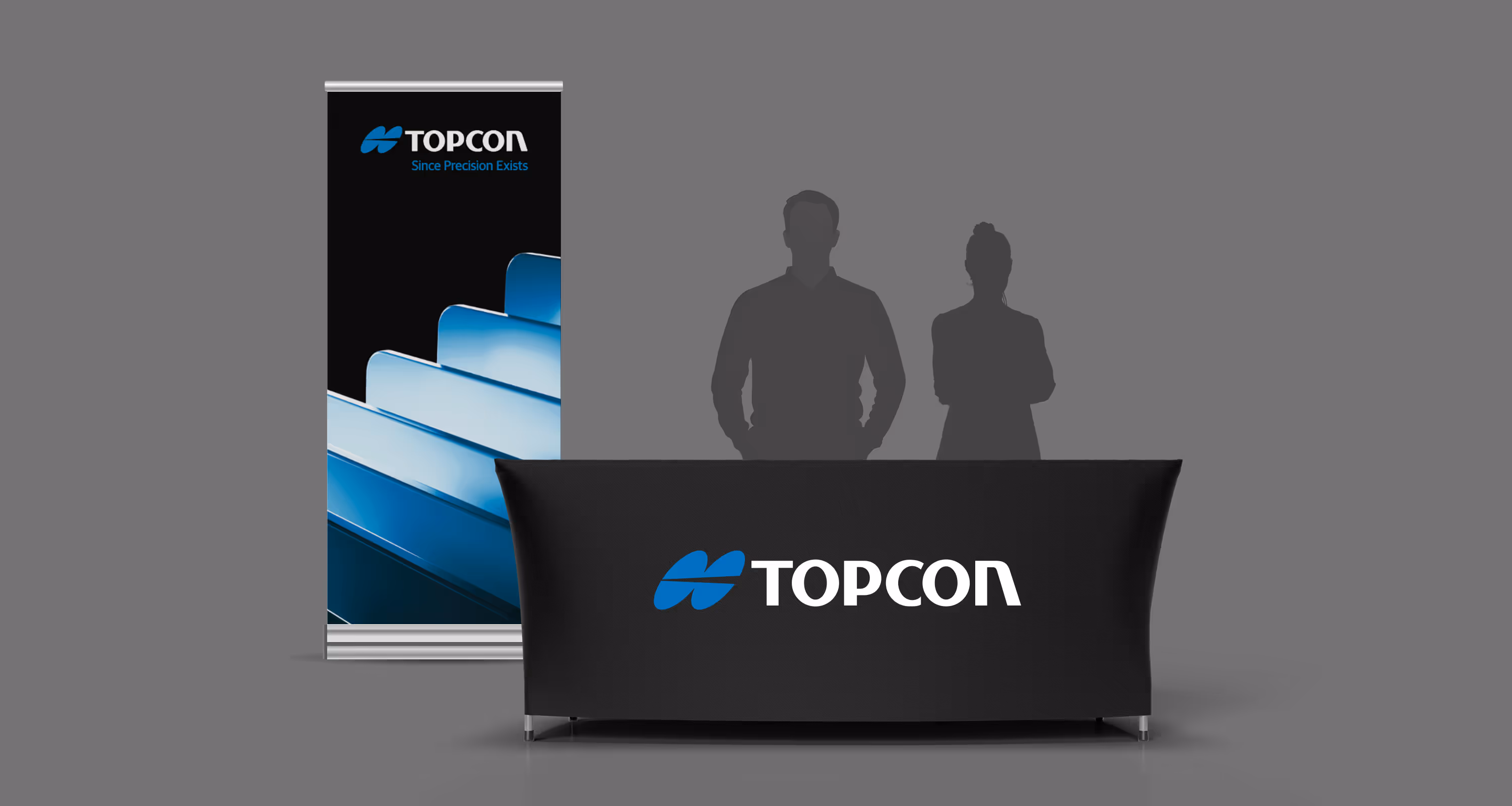
    Workstations

    The workstations are the only area within the booth where detailed product information is permitted. In most circumstances, this information should mainly be displayed digitally on a monitor. Since workstations are the most common element from booth to booth, it's important that these are all designed in a similar way. The three main elements of each workstation are a backdrop, monitor, and counter. Wayfinding text and icons should be placed at the top of the workstation backdrop and remain unobstructed by the monitor or anything that may rest on the counter top.

    Media screens

    It is preferred for product imagery to appear on digital media screens over printed graphics as it allows for dynamic content rotation, avoiding the need to cherry-pick specific images and enabling a more comprehensive representation of the diverse range of products. This approach prevents the risk of a static graphic underselling the full story of what the products offer, while also maintaining a clean and uncluttered booth aesthetic by eliminating the need for numerous printed visuals on the walls.

    Large-scale media

    Large-scale media screens in a tradeshow booth captivate audiences, providing a visually impactful and versatile platform to showcase dynamic content, convey brand messaging, and engage attendees with immersive, high-quality visuals.

    Small-scale media

    For smaller shows, compact media solutions like televisions or computer monitors are ideal, offering the flexibility to maintain a strong visual presence in a more intimate setting while ensuring cost-effectiveness and practicality.

    Guidance

    Below are some best practices to keep in mind when creating the various assets for your event.

    Do

    Follow our framework and design templates

    Use high-quality images and video content

    Maintain a clear messaging hierarchy

    Follow all brand guidelines

    Checkmark Icon
    correct

    Don't

    Use the same graphic or image everywhere

    Use low-quality imagery

    Crop imagery in a way that doesn’t show the full solution of a product or system

    Overcrowd walls or screens with information, graphics, or photography

    "X" icon.
    incorrect

    Design files

    To get access to all approved and current design files for tradeshows or if you have any questions, please reach out to brand@topcon.com